


File: src/blocks/hero/Hero18.astro
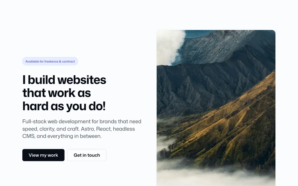
Same per-slide content as Hero 17 (image, overlay, eyebrow, title, text, CTAs), with side peeks, gaps, and border radius. Arrows stay fixed over the center slide slot while slides move underneath. Uses Keen Slider.
Config (blocks.ts → hero18)
hero18: {
    width: "wide",
    slides: [
      {
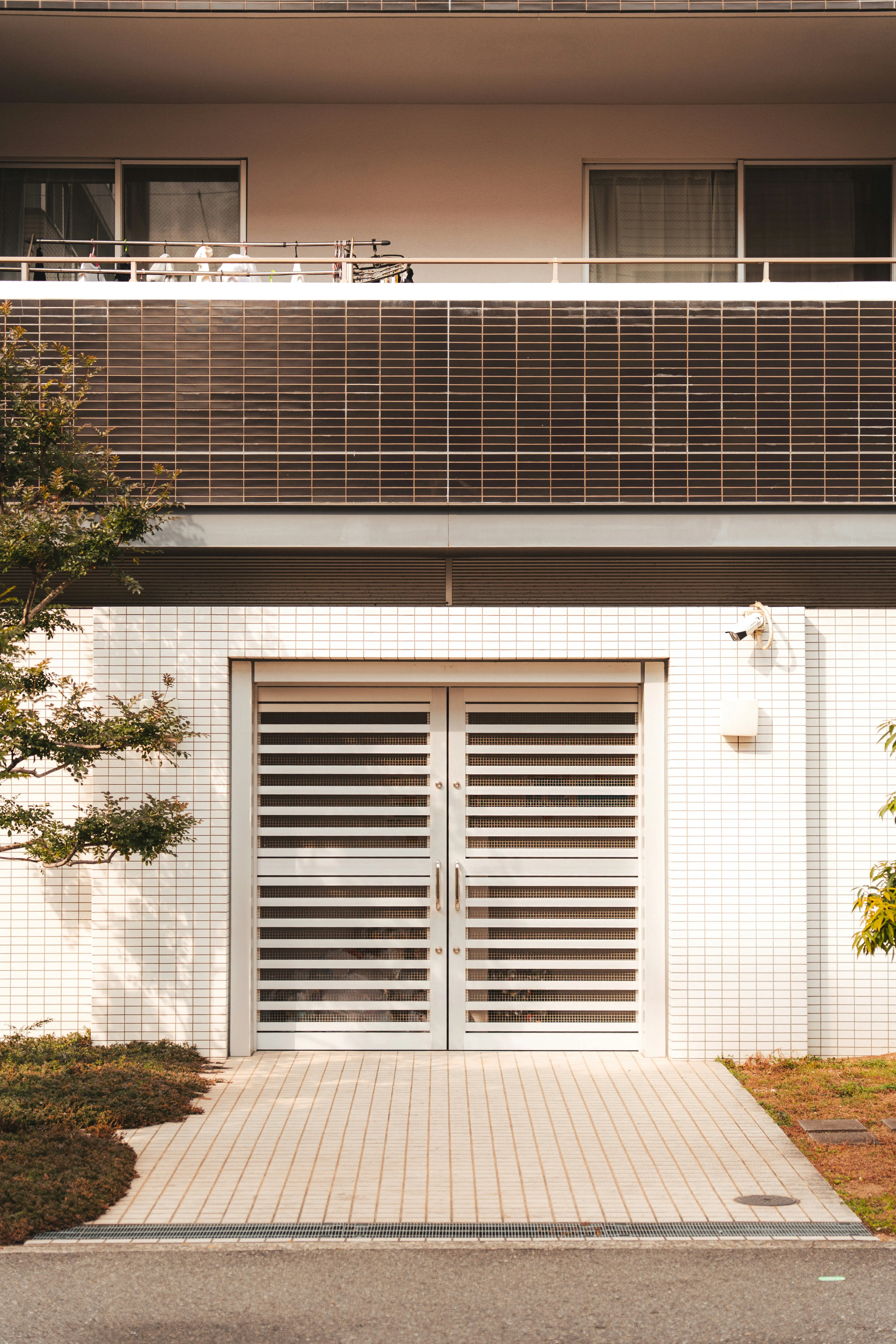
        image: photos.interior,
        imageAlt: "Interior detail",
        eyebrow: "Featured work",
        heading: "Spaces that feel considered from the first scroll",
        subheading:
          "Full-bleed storytelling for hospitality, retail, and brand launches — image first, copy where it lands hardest.",
        primaryCta: "View my work",
        primaryCtaUrl: "/work/",
        secondaryCta: "Get in touch",
        secondaryCtaUrl: "/contact/",
      },
      {
        image: photos.karla,
        imageAlt: "Portrait in soft light",
        eyebrow: "Available for freelance",
        heading: "I build websites that work as hard as you do",
        subheading:
          "Astro, React, and headless CMS for brands that need speed, clarity, and craft — without a redesign every quarter.",
        primaryCta: "Start a project",
        primaryCtaUrl: "/contact/",
        secondaryCta: "See services",
        secondaryCtaUrl: "/#services",
      },
      {
        image: photos.alexander,
        imageAlt: "Architectural study",
        eyebrow: "Performance & polish",
        heading: "Ship a polished site without rebuilding the foundations",
        subheading:
          "Composable blocks, token-driven themes, and image pipelines so every launch stays fast and on-brand.",
        primaryCta: "Browse work",
        primaryCtaUrl: "/work/",
        secondaryCta: "About",
        secondaryCtaUrl: "/about/",
      },
    ],
    overlayColor: "#000000",
    overlayOpacity: 0.45,
    contentTone: "light",
    height: "md",
    textPlacement: "center",
    textAlign: "left",
    slidePeek: 0.1,
    slideGap: "md",
    slideRadius: "2xl",
    sliderAutoplay: false,
    sliderSpeed: "normal",
    showDots: true,
    showArrows: true,
    sliderPauseOnHover: true,
    borderBottom: false,
    borderThickness: "sm",
    borderColor: "soft",
  },
Add to a page
---
import Hero18 from "@/blocks/hero/Hero18.astro";
---

<Hero18 />
Props override matching keys from config:
<Hero18
  slidePeek={0.15}
  slideGap="lg"
  slideRadius="xl"
  height="lg"
  showDots
/>
Props
| Prop | Config key | Type / values | Default / notes |
|---|---|---|---|
width |
hero18.width |
standard | narrow | wide |
Inner copy wrapper max-width |
slides |
hero18.slides |
Same slide shape as Hero17 | — |
overlayColor |
hero18.overlayColor |
CSS color string | Shared overlay for all slides |
contentTone |
hero18.contentTone |
light | dark |
light = light text / CTAs on dark overlay |
overlayOpacity |
hero18.overlayOpacity |
number (0–1) |
— |
height |
hero18.height |
auto | sm | md | lg | full |
Viewport min-height |
textPlacement |
hero18.textPlacement |
top | center | bottom |
Vertical placement of copy |
textAlign |
hero18.textAlign |
left | center | right |
Horizontal justification |
slidePeek |
hero18.slidePeek |
number (0–0.35) |
Fraction of each neighbor visible (e.g. 0.1 ≈ 10% left + right) |
slideGap |
hero18.slideGap |
none | sm | md | lg | xl |
Space between slides |
slideRadius |
hero18.slideRadius |
none | md | lg | xl | 2xl |
Border radius of each slide frame |
sliderAutoplay |
hero18.sliderAutoplay |
boolean |
Auto-advance slides |
sliderSpeed |
hero18.sliderSpeed |
slow (6s) | normal (4s) | fast (2.5s) |
When autoplay is on |
showDots |
hero18.showDots |
boolean |
Pagination dots |
showArrows |
hero18.showArrows |
boolean |
Prev / next fixed over the center slide |
sliderPauseOnHover |
hero18.sliderPauseOnHover |
boolean |
Pause autoplay on hover/focus |
borderBottom |
hero18.borderBottom |
boolean |
— |
borderThickness |
hero18.borderThickness |
sm | md | lg |
— |
borderColor |
hero18.borderColor |
soft | medium | hard |
— |
Also include: Keen Slider (keen-slider). Prefer photos.* — Images. Related: Hero 17 (full-bleed, no peeks).