
Versions
Preview coming soon
Navbar 0101
Sticky site header with links, dropdowns, and CTA
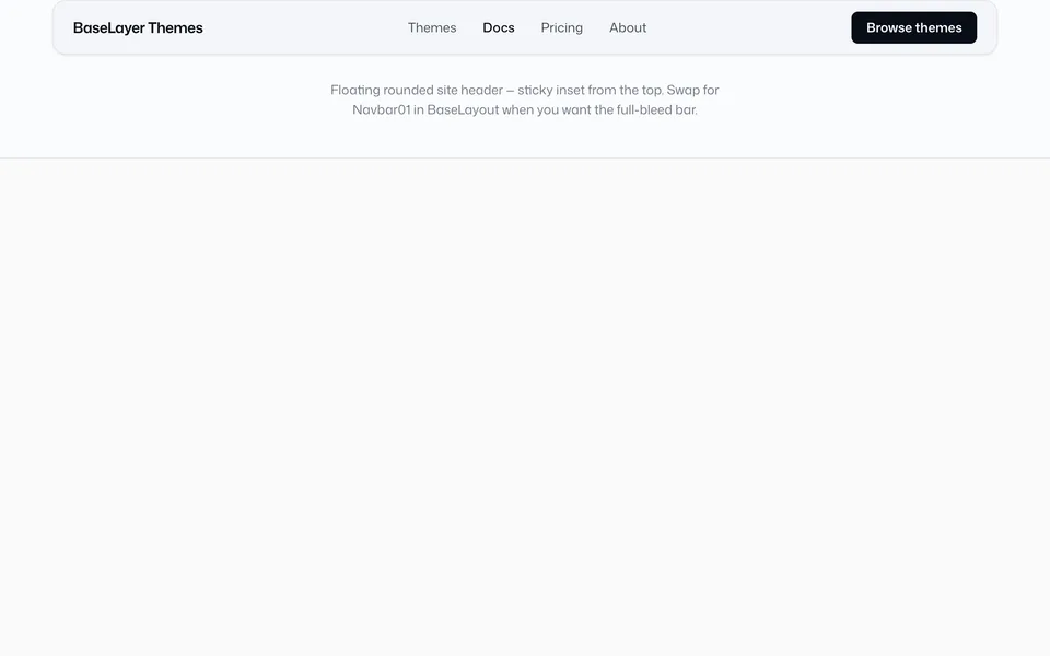
Navbar 0202
Floating rounded bar with links, dropdowns, and CTA
Preview coming soon
Navbar 0303
Full-bleed bar with described dropdown items, icons, and column layout
Preview coming soon
Navbar 0404
Full-bleed mega menu with featured, icon lists, and link sections
Preview coming soon
Navbar 0505
Minimal bar with slide-in drawer from left or right
Preview coming soon
Navbar 0606
Minimal bar with full-screen menu takeover
Folder: src/blocks/navbar/
Site chrome for primary navigation. All versions read identity.ts → navigation, share types in src/lib/nav.ts, and render dropdown content through src/components/nav/.
How to author menus: Navigation components — sections, children, featured columns, widths, and recipes.
| Version | Layout |
|---|---|
| 01 | Sticky full-bleed — single plain link list |
| 02 | Floating bar — single-column title + description |
| 03 | Full-bleed — two-column icon + title + description |
| 04 | Full-bleed mega menu (sections) — site default |
| 05 | Minimal bar — slide-in drawer (side left/right) |
| 06 | Minimal bar — full-screen takeover |
Highlights
- Short form —
childrenon any link (becomes one list section) - Mega menus —
sectionswithfeatured,icon-links, andlinks(optionaltitle/titleStroke) - Shared components — Navbar 01–06 all use the same panel pieces
- Trigger mode —
dropdownTrigger: "hover" | "click"(desktop dropdowns on 01–04); mobile / overlays are always tap - Overlays — Navbar 05 (drawer) and 06 (fullscreen) put all links behind a menu button
- Mobile — hamburger panel; nested content expands full-width as a vertical list
Open a version for the live preview and chrome-specific props. For config shapes and recipes, use the Navigation guide.