


File: src/blocks/hero/Hero17.astro
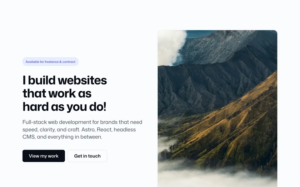
Full-bleed Keen Slider hero. Each slide is image + overlay + eyebrow, title, text, and CTAs. Controls for height, overlay color/opacity, text placement/align, arrows, dots, and autoplay.
Config (blocks.ts → hero17)
hero17: {
    width: "wide",
    slides: [
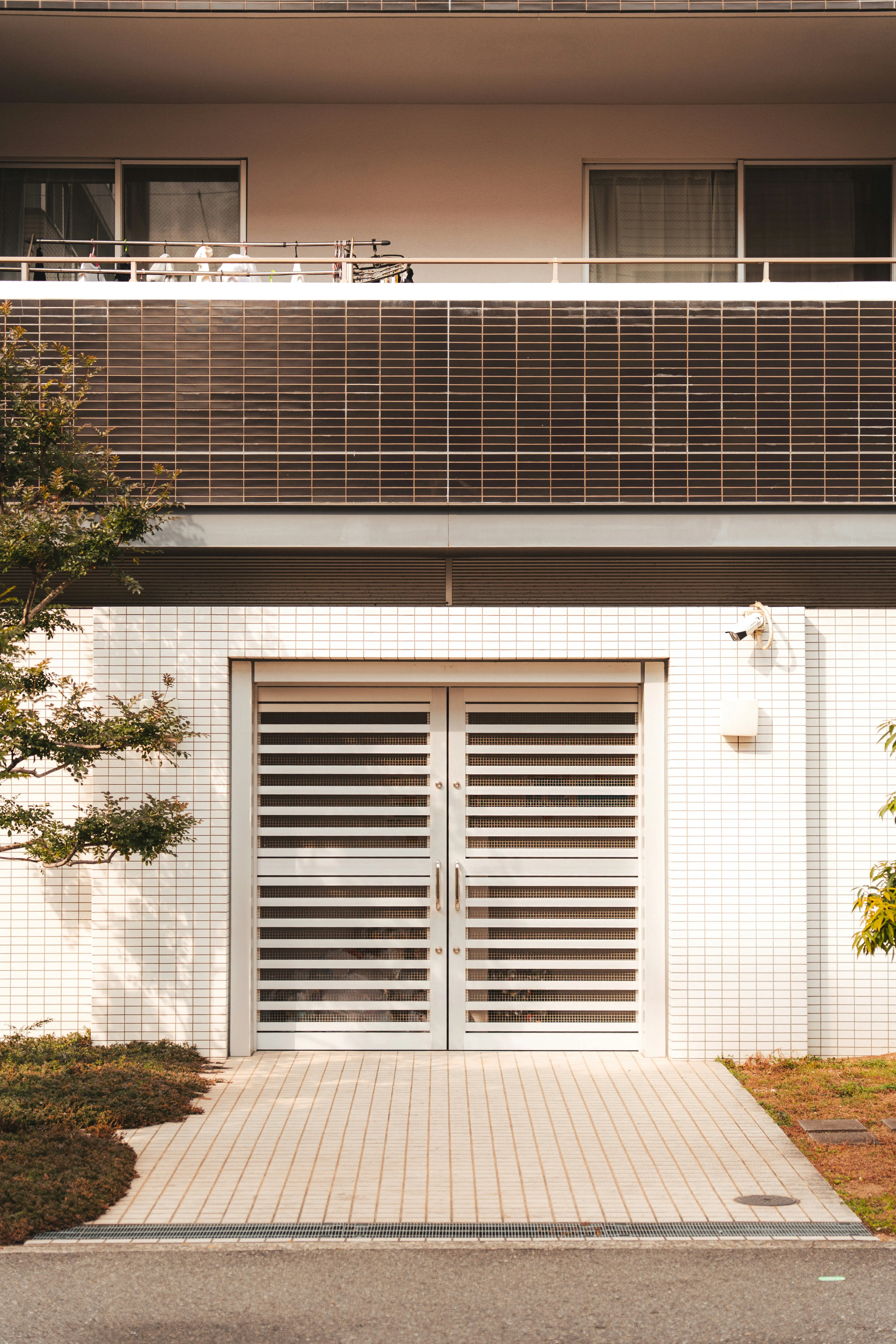
      {
        image: photos.interior,
        imageAlt: "Interior detail",
        eyebrow: "Featured work",
        heading: "Spaces that feel considered from the first scroll",
        subheading:
          "Full-bleed storytelling for hospitality, retail, and brand launches — image first, copy where it lands hardest.",
        primaryCta: "View my work",
        primaryCtaUrl: "/work/",
        secondaryCta: "Get in touch",
        secondaryCtaUrl: "/contact/",
      },
      {
        image: photos.karla,
        imageAlt: "Portrait in soft light",
        eyebrow: "Available for freelance",
        heading: "I build websites that work as hard as you do",
        subheading:
          "Astro, React, and headless CMS for brands that need speed, clarity, and craft — without a redesign every quarter.",
        primaryCta: "Start a project",
        primaryCtaUrl: "/contact/",
        secondaryCta: "See services",
        secondaryCtaUrl: "/#services",
      },
      {
        image: photos.alexander,
        imageAlt: "Architectural study",
        eyebrow: "Performance & polish",
        heading: "Ship a polished site without rebuilding the foundations",
        subheading:
          "Composable blocks, token-driven themes, and image pipelines so every launch stays fast and on-brand.",
        primaryCta: "Browse work",
        primaryCtaUrl: "/work/",
        secondaryCta: "About",
        secondaryCtaUrl: "/about/",
      },
    ],
    overlayColor: "#000000",
    overlayOpacity: 0.45,
    contentTone: "light",
    height: "md",
    textPlacement: "center",
    textAlign: "left",
    sliderAutoplay: false,
    sliderSpeed: "normal",
    showDots: true,
    showArrows: true,
    sliderPauseOnHover: true,
    borderBottom: false,
    borderThickness: "sm",
    borderColor: "soft",
  },
Add to a page
---
import Hero17 from "@/blocks/hero/Hero17.astro";
---

<Hero17 />
Props override matching keys from config:
<Hero17
  height="lg"
  overlayOpacity={0.55}
  textPlacement="bottom"
  textAlign="center"
  sliderAutoplay
  sliderSpeed="fast"
  showArrows={false}
/>
Props
| Prop | Config key | Type / values | Default / notes |
|---|---|---|---|
width |
hero17.width |
standard | narrow | wide |
Inner copy wrapper max-width |
slides |
hero17.slides |
Array of slide objects (see below) | — |
overlayColor |
hero17.overlayColor |
CSS color string | Shared overlay for all slides |
contentTone |
hero17.contentTone |
light | dark |
light = light text / CTAs on dark overlay |
overlayOpacity |
hero17.overlayOpacity |
number (0–1) |
— |
height |
hero17.height |
auto | sm | md | lg | full |
Viewport min-height |
textPlacement |
hero17.textPlacement |
top | center | bottom |
Vertical placement of copy |
textAlign |
hero17.textAlign |
left | center | right |
Horizontal justification |
sliderAutoplay |
hero17.sliderAutoplay |
boolean |
Auto-advance slides |
sliderSpeed |
hero17.sliderSpeed |
slow (6s) | normal (4s) | fast (2.5s) |
When autoplay is on |
showDots |
hero17.showDots |
boolean |
Pagination dots |
showArrows |
hero17.showArrows |
boolean |
Prev / next arrows |
sliderPauseOnHover |
hero17.sliderPauseOnHover |
boolean |
Pause autoplay on hover/focus |
borderBottom |
hero17.borderBottom |
boolean |
— |
borderThickness |
hero17.borderThickness |
sm | md | lg |
— |
borderColor |
hero17.borderColor |
soft | medium | hard |
— |
Slide object
| Field | Type | Notes |
|---|---|---|
image |
LocalImageSource |
Prefer photos.* |
imageAlt |
string |
— |
eyebrow |
string |
Optional |
heading |
string |
— |
subheading |
string |
Optional |
primaryCta / primaryCtaUrl |
string |
Optional |
secondaryCta / secondaryCtaUrl |
string |
Optional |
Also include: Keen Slider (keen-slider). Prefer photos.* — Images. Pass real CSS colors for overlayColor (not Tailwind class names).