
File: src/blocks/hero/Hero22.astro
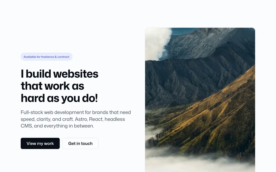
Like Hero19/21 — inset rounded solid frame — with a 50/50 split: left copy, right single image. The image fades into backgroundColor from its left edge (imageGradientWidth). On small screens the layout stacks (copy then image) with a top fade.
Copy uses the same full-width Wrapper + padding stack as Hero19–21 so left edges align.
Config (blocks.ts → hero22)
hero22: {
  width: "full",
  contentWidth: "wide",
  backgroundColor: "oklch(22% 0.025 260)",
  contentTone: "light",
  image: photos.interior,
  imageAlt: "Interior detail",
  imageGradientWidth: 0.45,
  height: "sm",
  textPlacement: "center",
  textAlign: "left",
  radius: "2xl",
},
Add to a page
---
import Hero22 from "@/blocks/hero/Hero22.astro";
---

<Hero22 /><Hero22
contentTone="dark"
backgroundColor="oklch(94% 0.012 260)"
imageGradientWidth={0.35}
height="md"
/>Props
| Prop | Config key | Type / values | Default / notes |
|---|---|---|---|
width |
hero22.width |
narrow | standard | wide | full |
Frame max-width; full keeps gutter |
contentWidth |
hero22.contentWidth |
standard | narrow | wide |
Wrapper max-width |
backgroundColor |
hero22.backgroundColor |
CSS color | Solid fill + image-edge gradient source |
contentTone |
hero22.contentTone |
light | dark |
Copy / CTA contrast |
image |
hero22.image |
LocalImageSource |
Prefer photos.* |
imageAlt |
hero22.imageAlt |
string |
— |
imageGradientWidth |
hero22.imageGradientWidth |
number (0–1) |
How far the bg→image fade extends |
height |
hero22.height |
auto | sm | md | lg | full |
Frame min-height |
textPlacement |
hero22.textPlacement |
top | center | bottom |
— |
textAlign |
hero22.textAlign |
left | center | right |
— |
radius |
hero22.radius |
radius token | — |
| Border props | — | same as Hero19 | — |